House of Grey/London Interiors
A starkly modern aesthetic transforms into a calming, rich minimalist website to reflect the interiors firms own design work.
—
rebranding
—
website design
—
website build
—
4 week turnaround
the challenge
the challenge
House of Grey was an established business with branding and a website when they came to us…neither was wrong, but they also weren’t right for them anymore. The brand had evolved and the modern vibe came across too stark not accurately reflecting the materials-rich style they had made their signature. They were due to be featured in an international design magazine in a month, so time was short if they were going to align their online presence with their offline persona.
the solution
the solution
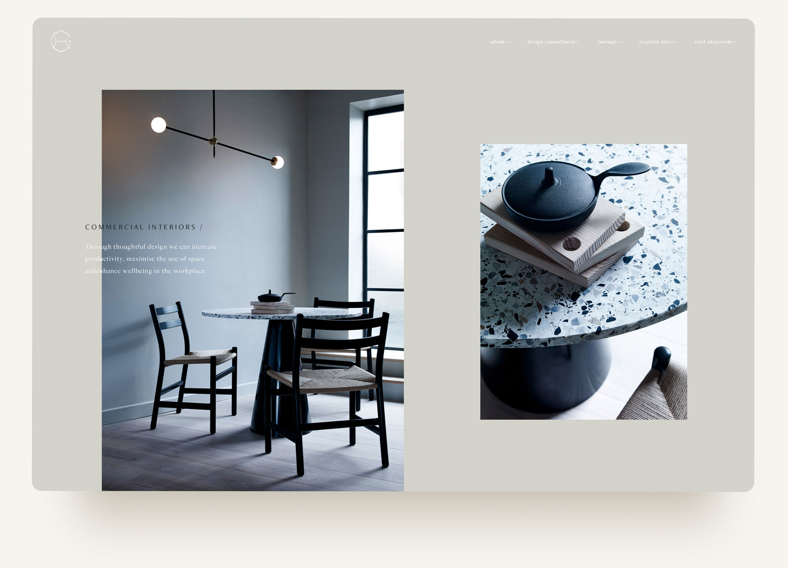
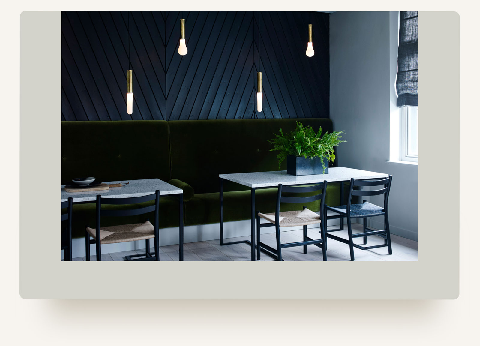
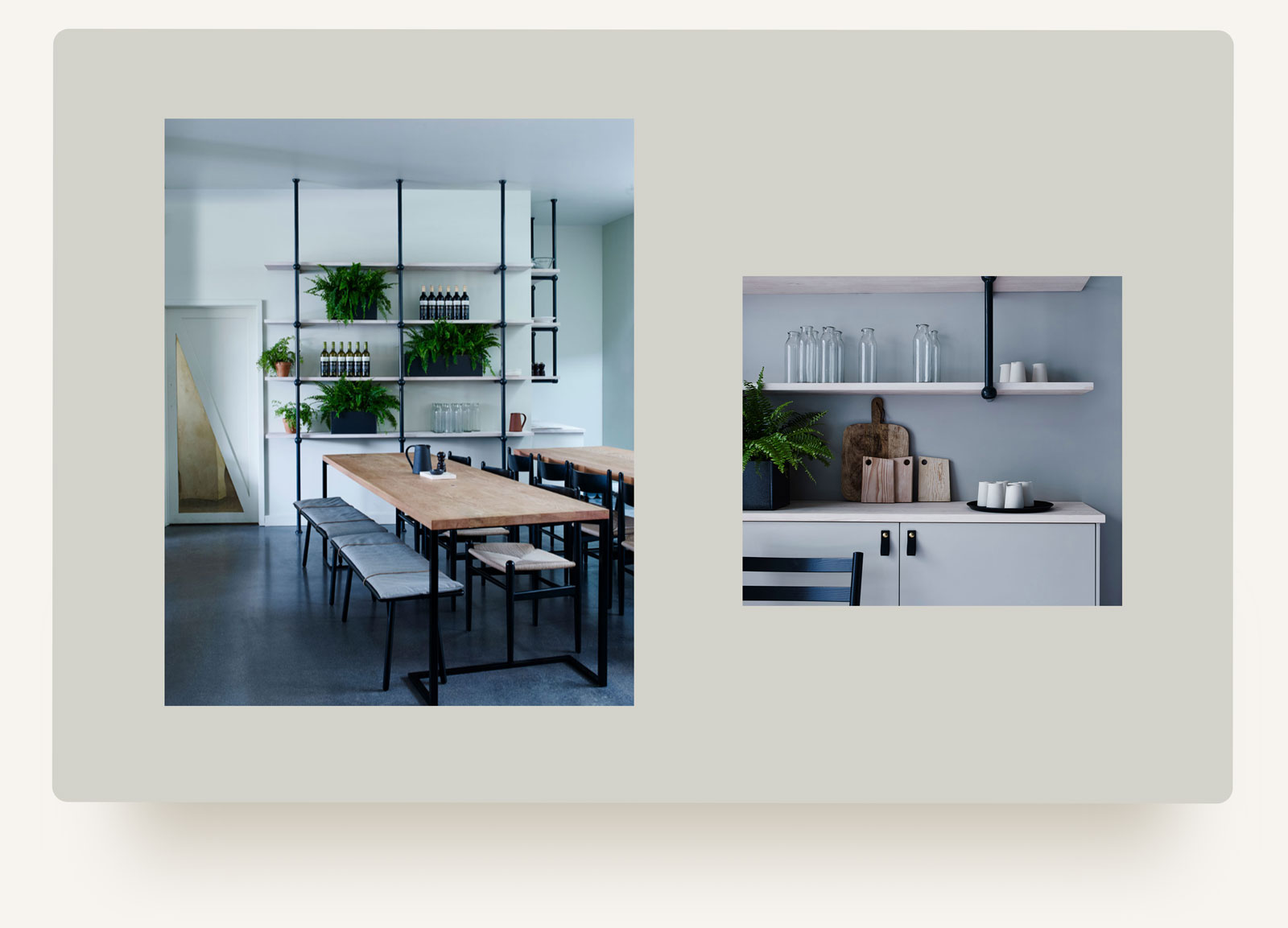
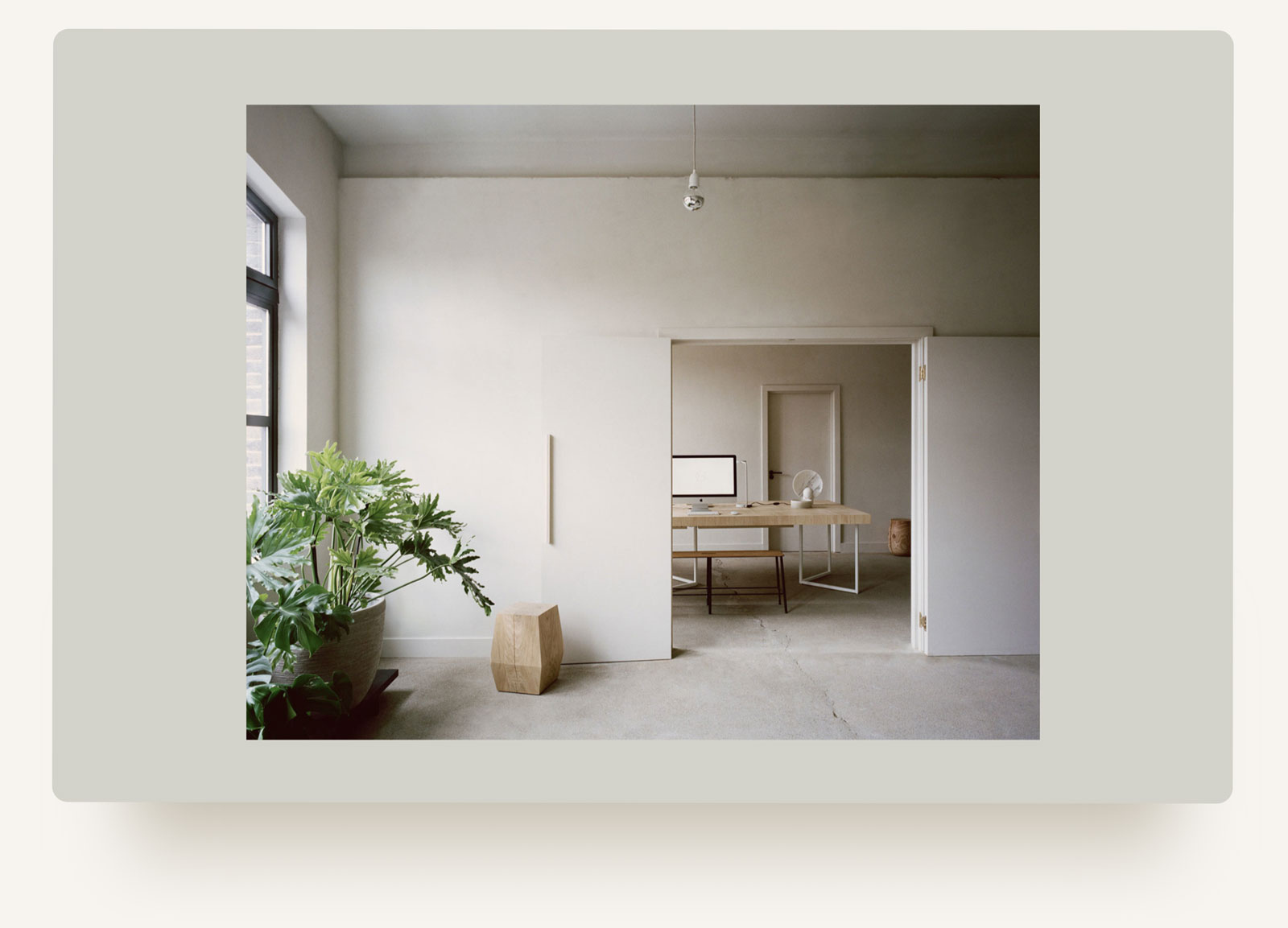
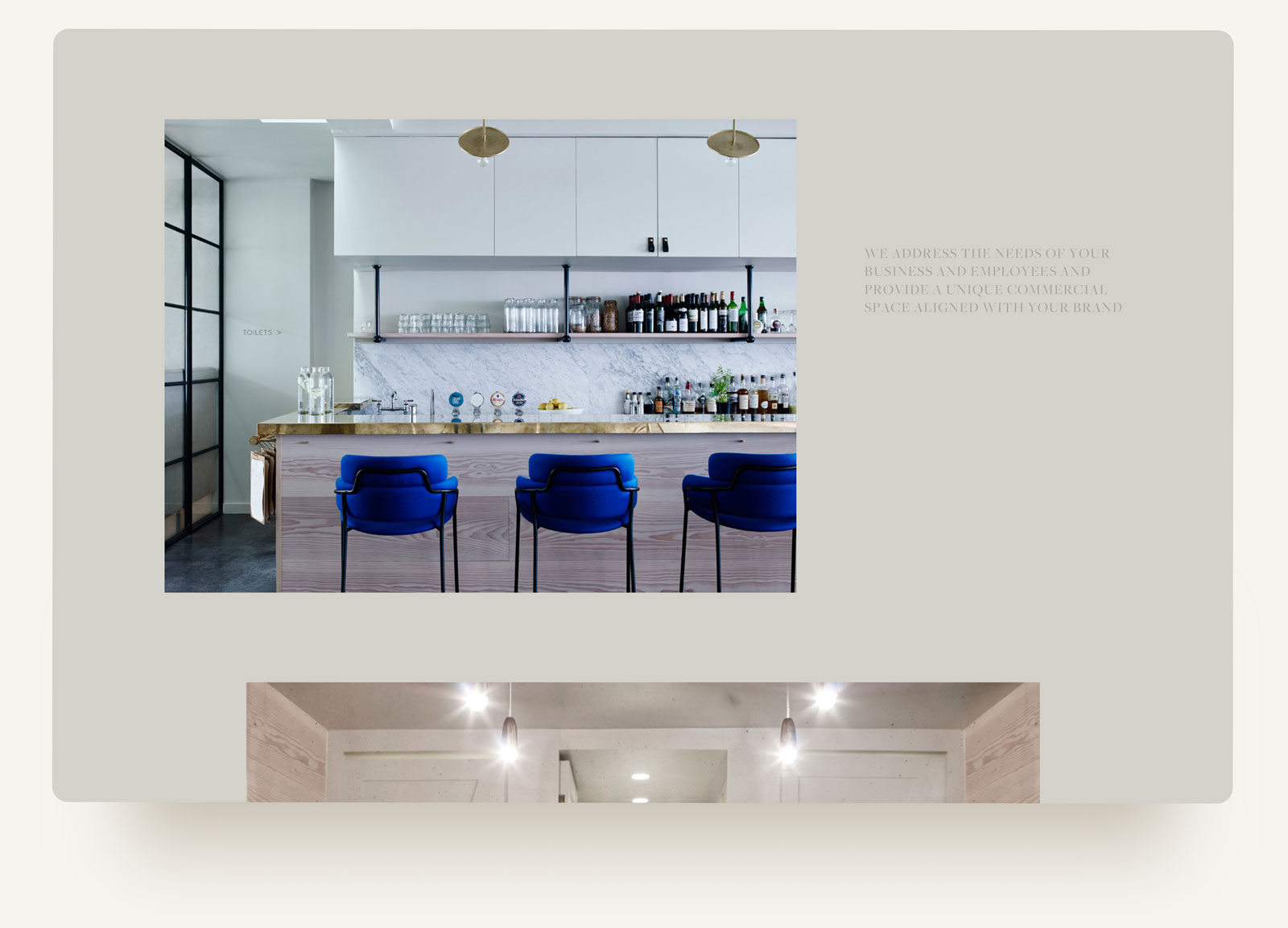
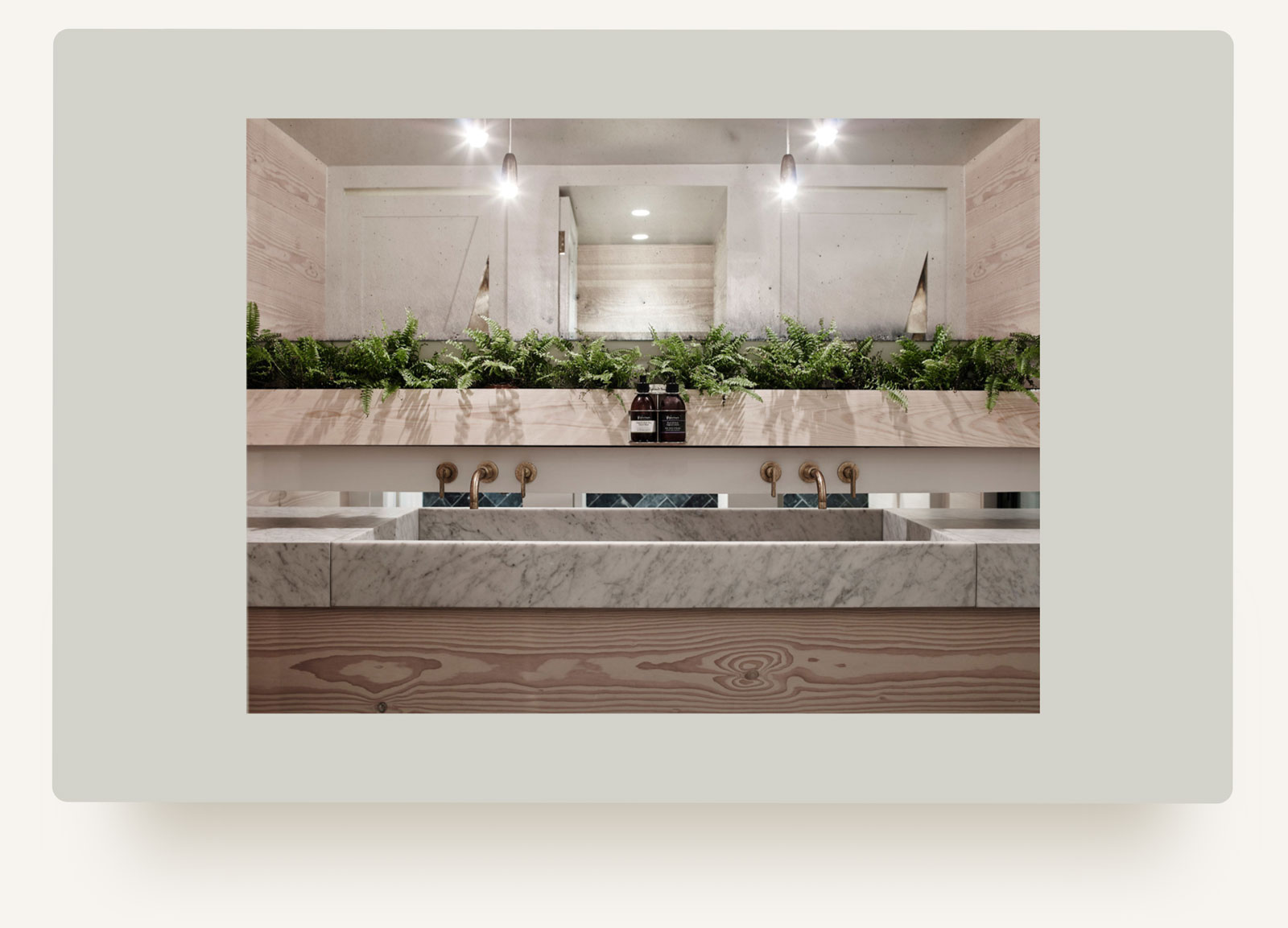
We restructured the site to help people understand the scope of their offering and created a layout that would give space to the photography but with context, pace and interest–not just a generic slideshow. We also made tweaks to typography and colours. Through a lot of small changes, we were able to move the aesthetic of the brand to align better with their values and deliver a site in time for their press appearance.
adding warmth
adding warmth
House of Grey was happy with the concept of their logo, but felt the execution no longer fit with their organic, material rich aesthetic. We reimagined the linework of the icon using inspiration from a stamp the owner had used in her clay pottery to give their mark a more earthy and textured feel.
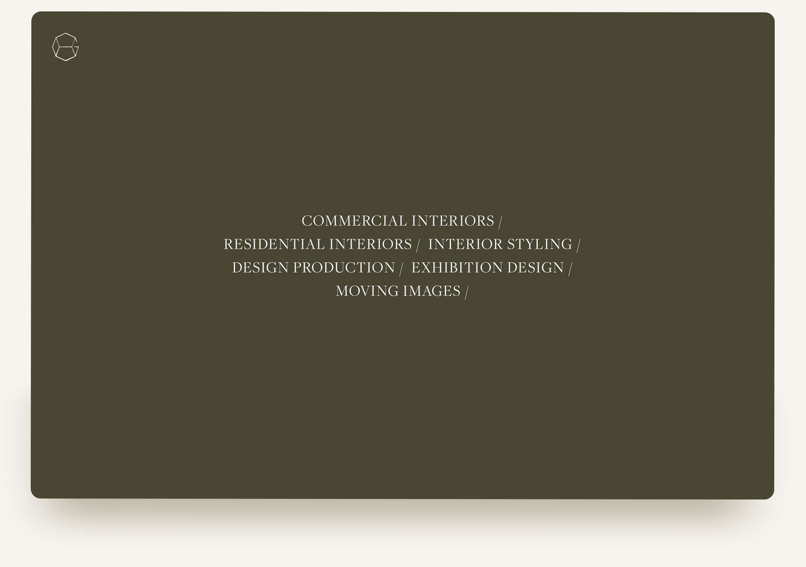
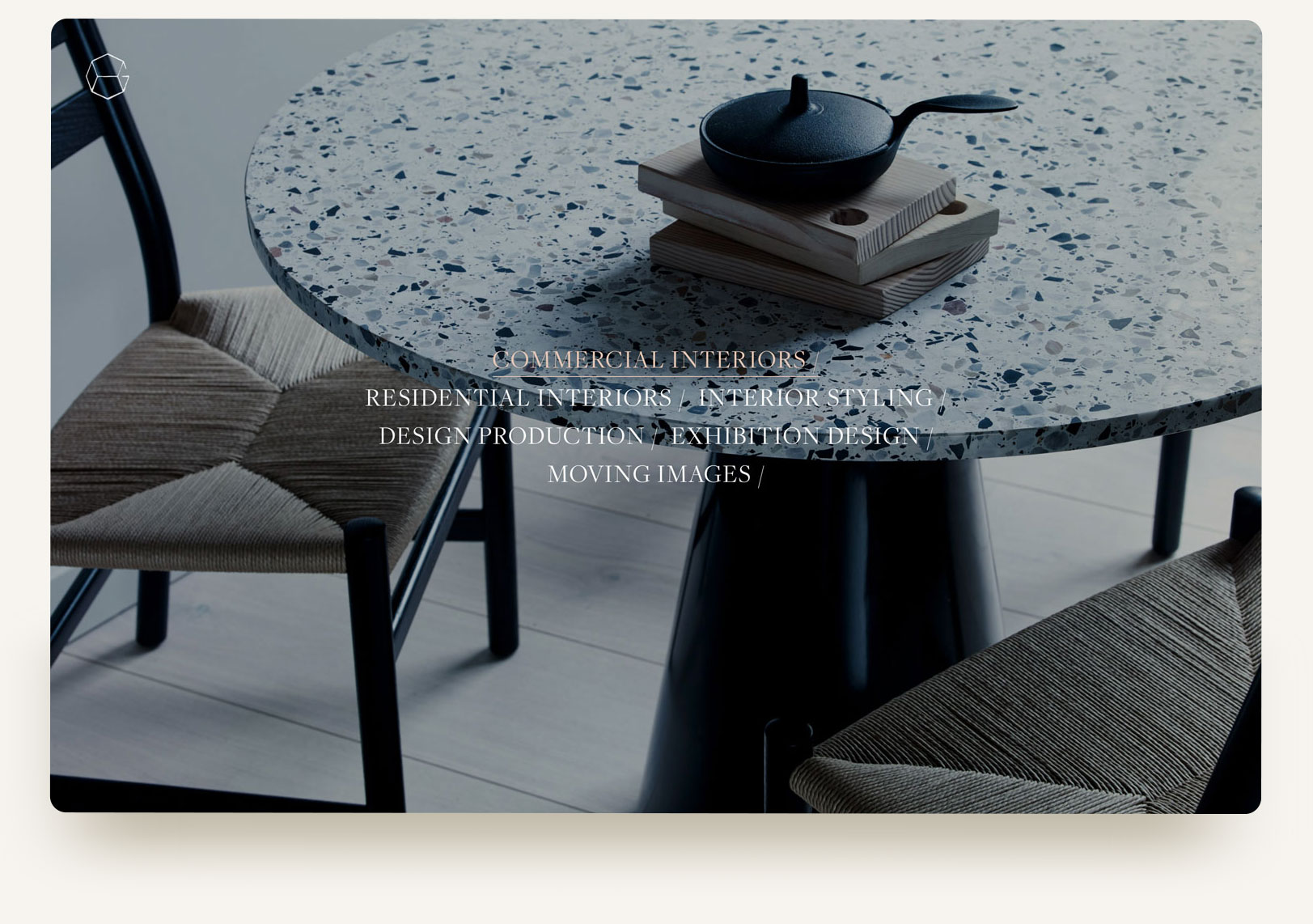
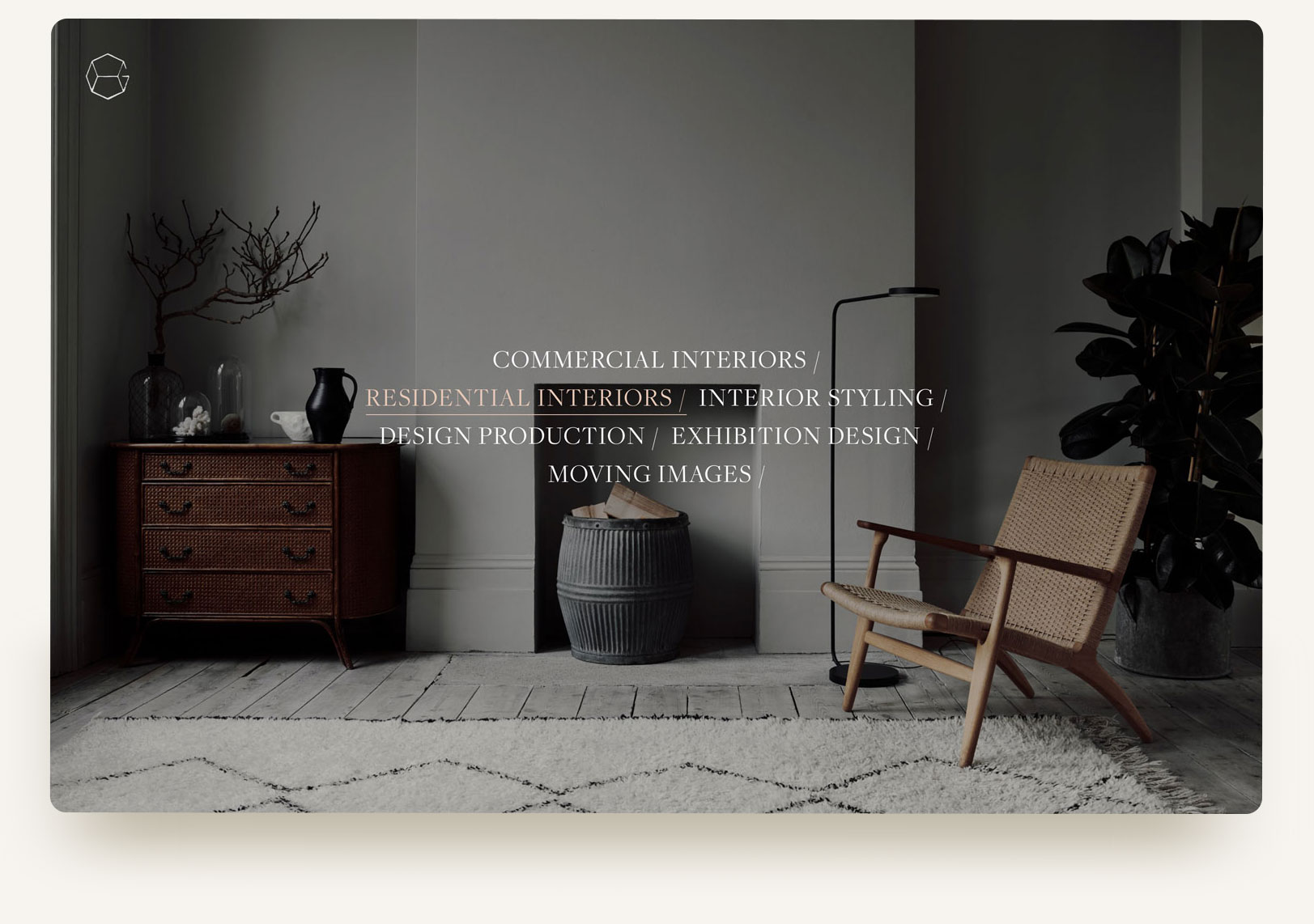
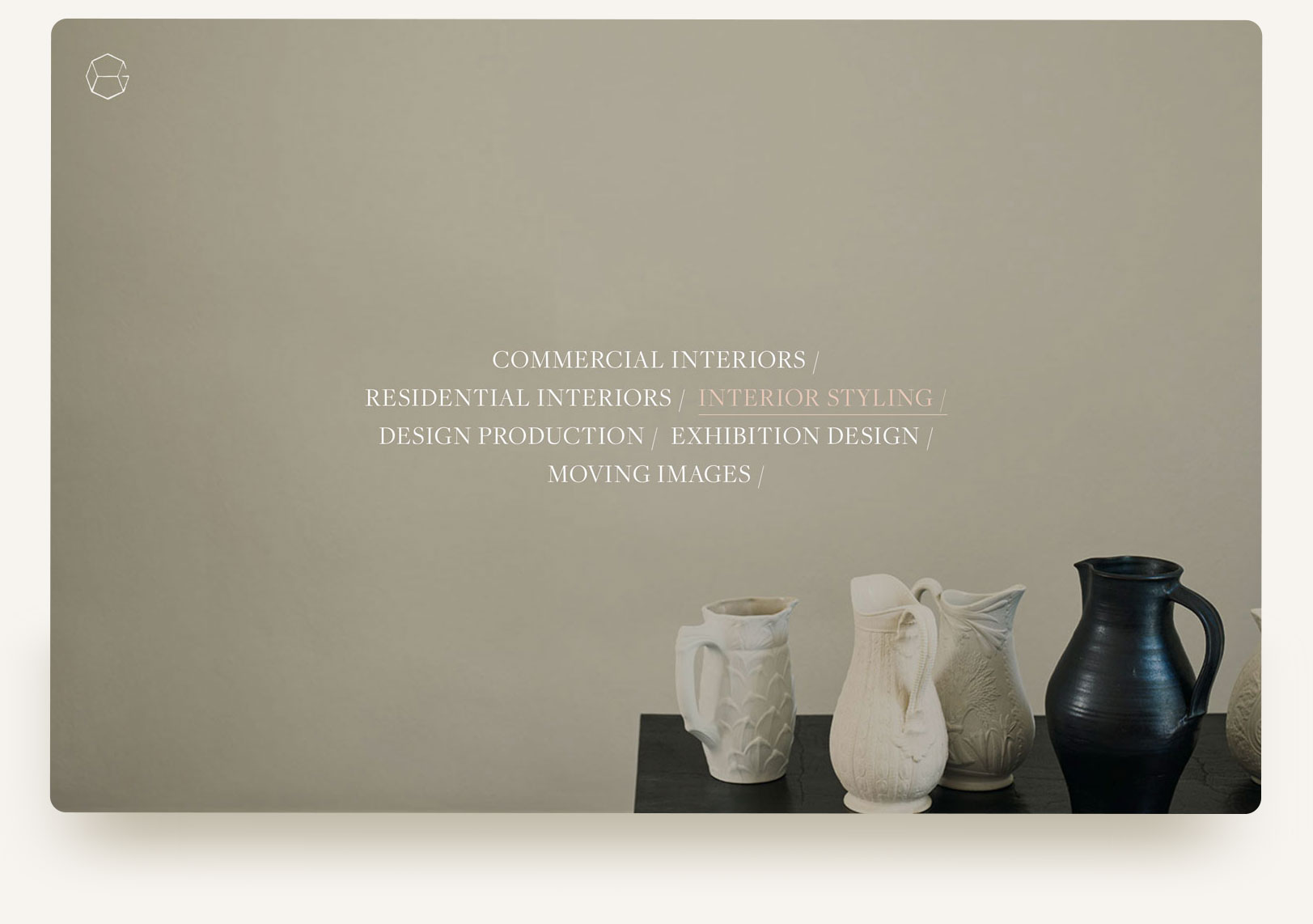
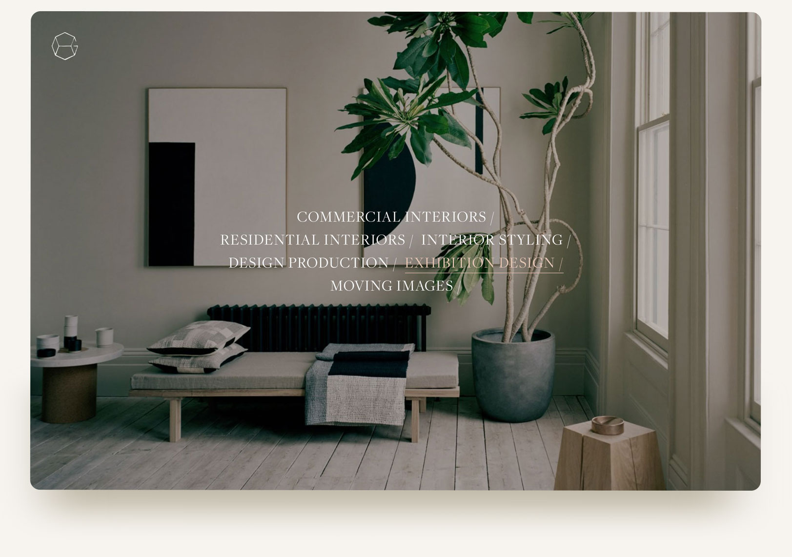
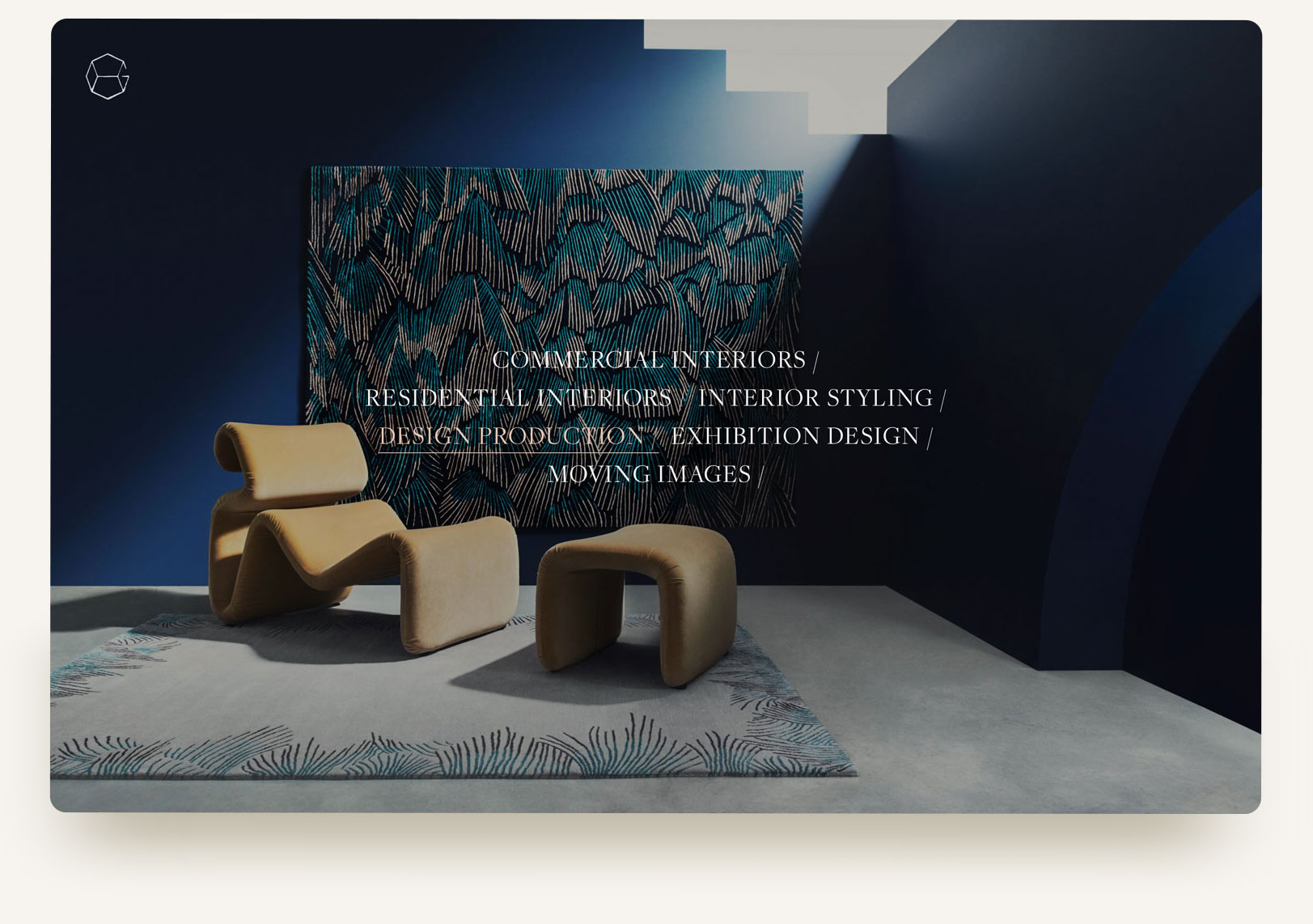
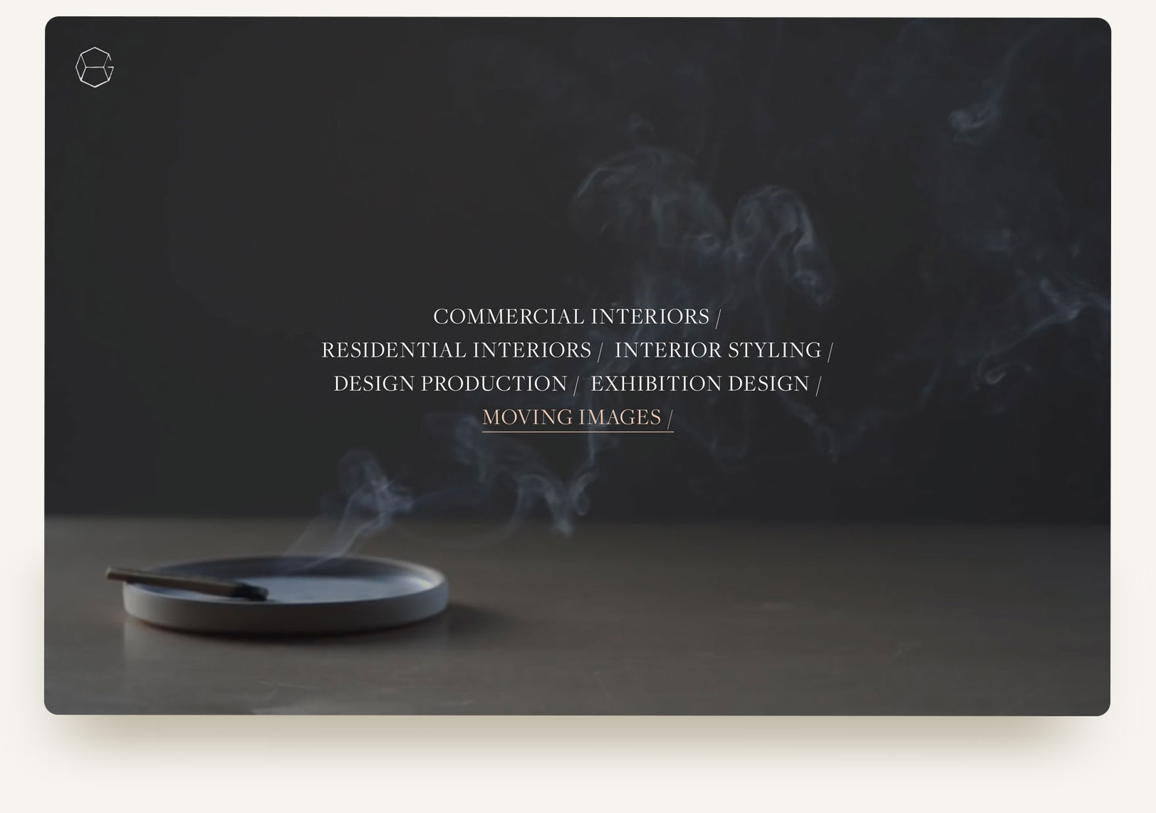
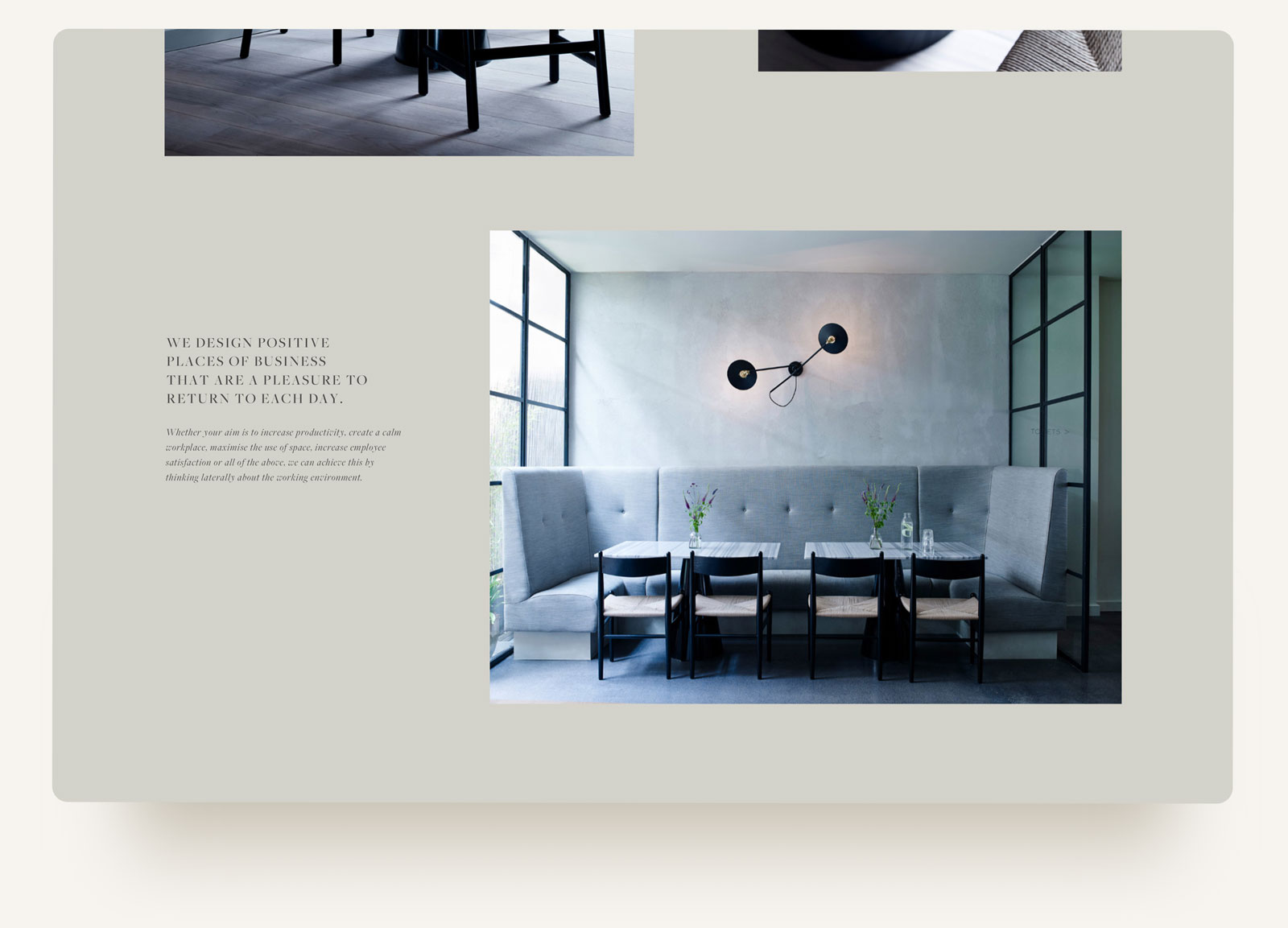
first impressions
first impressions
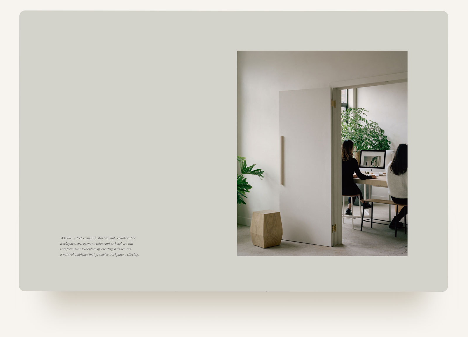
House of Grey offers a variety of services in the interiors sector, which was a challenge to convey in their previous website. Our solution created a dynamic visual representation of the business before you even entered the website, by using their offerings as a typographic menu. This scrolled through like a mini slideshow, while highlighting the service and allowed you to jump right into the area of interest within the website.

we introduced a new typeface, subtle colour palette and layouts for a sophisticated site that reflected the understated luxury of the spaces they design.
credits
—
website design | beckon.
rebranding | beckon.
platform | squarespace
logotype | marion rhoades
styling | house of grey
photography | rory gardiner
photography | jake curtis